If it were enough to merely put a product image and buy here link on your page, every online business would be a success.Unfortunately, it’s not that simple.
In order to boost your conversion rate, or the rate at which page visitors become paying customers, you must take a few very important steps.If you apply the seven following tips, your product page should make a stronger impression. These changes will also hopefully improve your rate of successful sales.
Make Sure You Properly Display Products (and Possible Alternatives)
When you’re trying to sell a product, it should be the largest image on the page. Some products should be seen from multiple angles; consider a 360 degree gif that turns so that the visitor can get a complete mental image of your product.
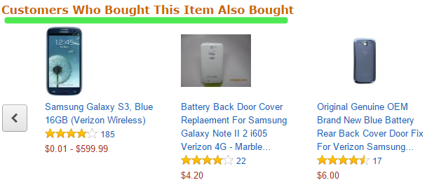
Do you have similar products you’d like to sell? Many businesses feature relevant images along the right-hand side or bottom of the product page. The visitor may be interested in a general product, and find something more specific to their liking if relevant products are made available to them.
The Purchase Button Should Be Highly Visible
If your visitors cannot find the buy option, they aren’t going to spend long searching for it. Rather than lose customers to frustration, make sure that you include a very large and highly visible purchase button.
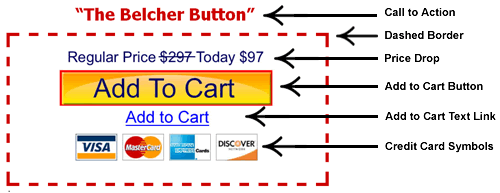
The Belcher Button is supposed to be an extremely successful visual aide that encourages visitors to buy. However, it’s believed that using a larger purchase button in general can increase sales.
Whatever you do, make sure that your customers are easily able to navigate to the checkout page.
Use Detailed Description
A large call-to-action headline is ideal, but it’s not enough to inform visitors of exactly what it is they are looking at.
- What does your product do?
- Why is it better at this than other products?
- How will it make the customer’s life easier?
- Are there any special features or add-ons?
This information can play a huge role in determining whether or not a visitor converts to a paying customer.
Make It Shareable
You should include social media buttons on each of your product pages. This would make the items shareable on sites like Pinterest, Facebook, Twitter and Google+.
If customers are happy with a product and want to show it off, this can potentially lead to greater exposure, which in turn might lead to an increase in consumer purchases.
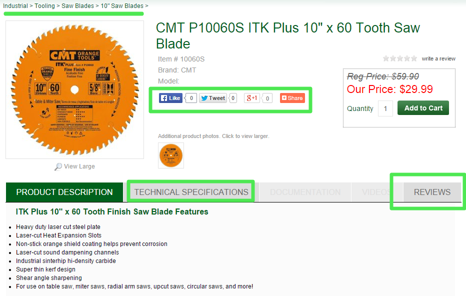
Social sharing features should work in tandem with the rest of a product page. Let’s break down an entire product page to pick out the most vital elements:

In this example we’re looking at a product page with social sharing options embedded smack-dab in the center of the page, signaling that many eCommerce sites are noticing the growing benefits of having sharing features attached to specific products. The following elements are present:
- Breadcrumbs with clear labels and tiers
- Social sharing buttons in an easily accessible location
- Concise product descriptions, technical specifications, and reviews
- A product price cut of 50% to incentivize users to buy
- A sizeable image to help visitors get a better idea of what they’re buying
When designing a product page don’t neglect the potential social media. Visitors who share products can easily send referrals. It’s essentially word-of-mouth marketing but on social networks.
Mind Your Font and the Background Color
The look of your page and choice of font can immediately make a strong impression. Even if your page lacks dazzling imagery and sliders, sometimes a sleek font on a white background is all you really need.
Stick to fonts perceived as being more businesslike and elegant. Serif and sans-serif fonts are probably the most recommended in this regard.
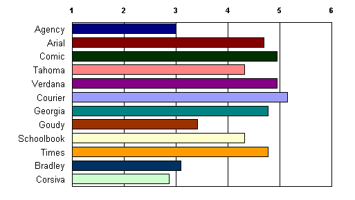
Be sure that your font is legible and that it does not clash with the background. For reference, here is a graph visualizing the legibility scores for commonly used business fonts:
Consider Adding Credibility Indicators
There are different ways of establishing credibility.
The easiest is a five-star rating system. The image doesn’t have to be stars per se; it can be hearts, circles or even an image relevant to your company’s brand.If you want to ensure that the ratings come from genuine customers, you can make it so that customers can only rate a product after they’ve purchased it.
Do not make the mistake of only allowing positive reviews and comments and deleting negative ones. Word will get around and it will make your online business seem deceptive and untrustworthy.You should also consider posting testimonials from happy customers.Even if customers aren’t happy with your product, this presents another method of demonstrating trustworthiness.
Be sure to contact unhappy customers or answer angry reviews with an apology and what they need from you to improve their purchase experience. This includes returns/refunds.
Here’s an example of a product page putting all of these tips into action:
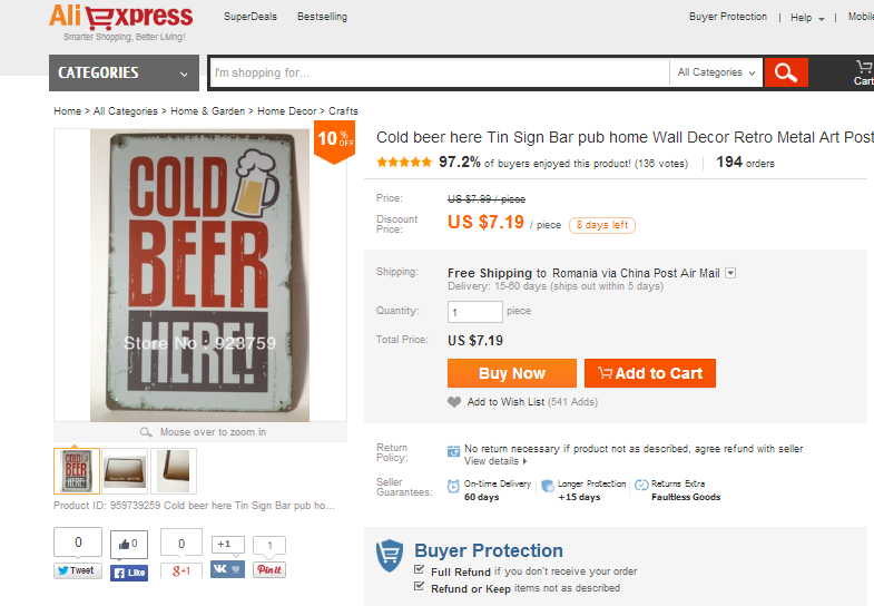
- They have both a star and percentile rating system
- They show the total number of orders
- The use social sharing buttons under the product images
- They have prominent action buttons
- They use urgency to incentivize purchasing at a discount
In addition to these criteria, they tactfully display four types of credibility enhancers. They show on-time delivery, longer protection, return policy, and a prominent buyer protection call-out.
Use Fear of Missing Out to Increase Sales
No one wants to miss out on anything that could be potentially amazing. If you are running low on a particular product, definitely let your visitors know.

The fear of missing out can be a powerful tool of persuasion. It’s why many sales only last a few days at most. If people think they can get a bargain any day of the week, they’re less likely to feel a sense of urgency.
For your product page, consider using this fear of missing out by informing customers that certain items are nearly sold out.When customers see that an item’s stock is low, this informs them that the product is very popular and well-liked. The indication that product availability is low raises the necessary sense of urgency which leads to a sale.
While it may be in bad taste to scare a customer outright into buying a product, the fear of missing out is something that is merely human nature. Using the customer’s own desire to be part of something before it’s too late isn’t exploitative; it’s simply a good business practice.
Be sure to use these tips to increase your conversion rate. The harder you work towards making a lasting impression, the more likely visitors will remember your products and return in the future.
