What is the main thing in web design? Probably, there are many of them. But I guess you will agree that there is no single design that can exist without a proper color scheme.
What role does a color play in web design? On the one hand, color communicates particular mood and emotions; I’ll talk about it in details below. On the other hand, color helps to show the importance of each block on the site: usually the most important blocks are made more visible and supplemental elements are less visible due to color choice. So the role of colors can’t be overestimated.
Color combinations
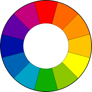
Color choice should not be undigested. There are special rules for choosing colors as well as the types of color combinations, or color harmonies. The base of these combinations is the color wheel:

There are a few types of color harmonies. The main of them are complementary and analogous.
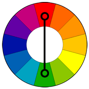
Complementary colors are colors that are opposite to each other on the color wheel:

They look good if used wisely. You can use them to make something stand out but never use them for texts as this will reduce readability.
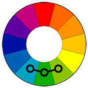
Analogous colors are found near each other on the color wheel:

Unlike complementary, analogous colors are calm. They add harmony and are pleasant to the eye. However, you should choose one color to dominate, a second to support it and a third one for accents.
Here is an example of using complementary and analogous color schemes:

The site using complementary colors (on the left) looks energetic; you can see a clear call-to-action and want to complete this action. The site on the right uses analogous colors, therefore it looks calm and peaceful.
The choice of the color scheme greatly depends on your goals as a web designer and of course on the business goals of your client. So you should get to know the business better before you start designing for it.
Color meanings
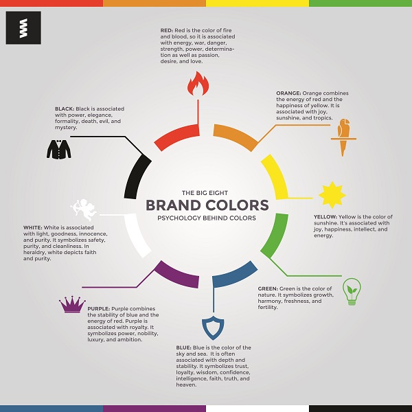
As you have understood, colors are like words that can help a site to speak with its visitors. The message your site will convey and the emotions it will provoke greatly depends on the colors used.
Here are general colors meaning. Once you know these meanings, it will be easier to choose color schemes for your designs.

Color and conversion rate
Though you now know meaning of the main colors, choosing the right color for CTA can still be challenging.
For example, the main goal of an eCommerce store is to sell. To buy something a customer usually needs to click a button with the call to action like “Add to cart” or “Buy now”. So which color is the best for this button? Maybe red as it conveys power and passion? Or maybe green which symbolizes harmony and growth?
As a matter of fact, you can hear opposite opinions from conversion optimization specialists on this matter. The truth is there is no general rule of thumb when it comes to choosing the color for your call-to-action buttons. But still here are some facts that will help you:
1. Contrast is the key
The button must be visible; it means that you should use a color which contrasts to the background. For example, if you are using a lot of green in design, a green “Add to cart” button is likely to be “lost”, so you can use a red button instead.
2. Research and test
The best way to find out which color works best for you is to AB test color variations. But first you will need to conduct a research. You can even use heat maps of the pages to see which elements are clicked on more often.
Wrapping Up
As you can see, there is no general color scheme which will work for any site or online store. It all depends on the target audience, their expectations, age, on the business goals on the whole. That’s why creating good designs is a real art and you can master it by constant research and practice.
