Redesigning A Website Can Be Very Tricky. Luckily There Notable Examples To Learn From And There Are A Few Tricks To Know. Redesigns Have A Lot Of Obstacles To Overcome. Users Are Often Against Changes Because They Are Emotionally Attached To Old Layouts. Its As If Someone Else Is Decorating Their Home. But Redesign Are Often A Must To Implement New Technology, New Features, And Attract New Visitors.
One Good Way To Understand The History And Evolution Of The Internet And Web Design Is To Look At Old Websites. There Are Several Archiving Websites That Keep Old Website Designs. Websites Such As Archive.org Keep A Large Collection Of Website Designs. Archive.org Is Great Because It Is A Non-profit Digital Library That Is Free To Acess And It Is Extremely Easy To Use. Archive.org Often Saves Multiple Layouts Of A Website In A Single Day That You Can Acess Anytime.[1]
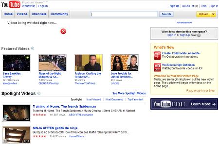
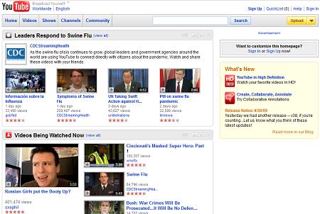
There Has Been Many Youtube Iterations Over The Years, But There Has Not Been Any As Controversial As The Two Redesigns That Happened In 2009. In April 2009 Youtube Changed The Homepage Which Gave Users The Impression That Youtube’s Entire Future And Focus Will Change. Another Controversial Redesign Is The Youtube Channel 2.0 Update That Happened Soon After..
Youtube On May 1st 2009
Although These Changes Seem Minor At A Superficial Glance This Update Totally Changed The Perception Of Youtube At The Time. The Update Brought Which Content Is Brought To The Forefront. What Youtube Was Doing In This Update Was Bringing Big Content From Large Media Corporations To Youtube. This Update Was Lampooned By The Community As The “Hulufication” Of Youtube.[2] To Users, Yotube Represents A Great Medium Where Amateurs Can Start From Nothing And Become Hugely Popular. Many People Were Outraged And Predicted Doom For Youtube. Eventually Google Decided To Change This Trajectory For Youtube. Instead Of Bringing TV Shows And Movies To Youtube Google Choose To Bring This Content To Google Play Service. [3]
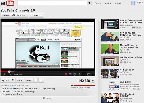
The Video That Introduced Youtube Channels 2.0
The Most Controversial Is The User Account Channel Update That Youtube Called YouTube Channels 2.0. In A User Generated Content Site Redesigns Are Even More Resisted. User Generated Content Websites Give Users Such As Profiles. On These Websites Users Feels More Attached To Their Space And Feel More Entitled To What Happens To Their Content, Which Is Quite Understandable. When Youtube Introduced The Channel Redesign It Was Almost Universally Hated. In The Introductory Video For The New Channel Designs Almost 90% Gave A Thumbs Down. [4] There Are Multiple Reasons For This. There Was Lots Of Bugs At First. The Customization Seemed Complicated Although Developers Believed It To Be Easy. There Has Not Been Such A Major Channel Redesign Since Then But There Has Been Slow Implementation Of New Changes. This Is Partially Because Of This Update.
Even The Most Successful Social Network Has Problems With Updates. Facebook Updates All The Time Its Feels Like Its Never The Same. They Also Change The Privacy Setting Controls. Privacy Issues Aside The Most Controversial Design Change Was The Facebook Timeline.
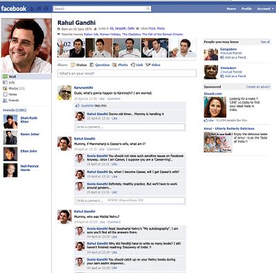
Typical Facebook Profile Before Timeline
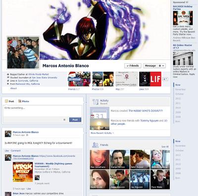
Typical Facebook Profile After Timeline
The Facebook Timeline Redesign Was Very Negatively Received. According To MarketPlace.org Only 8 Percent Of Users Liked Timeline. [5] There Was Many Complaints Such As The Dual Column Layout. For Many People This Made Looking At Content A Choir. This Because People Are Used To Reading From Even Left To Right And The Dual Column Layout Is Uneven. [6] One Other Feature People Hated Was That Facebook Decides Which Content Is Displayed. There Are Algorithms That Displays Certain Content So You Have To Search Click Around To Reach Certain Content. As Adam Detzner Explains, “In A List Of Friends You Made In 2010, The Biggest Photo Will Be Of The Person Tagged With You In The Most Photos, Or The Person Who Liked The Most Of Your Statuses, Or Whatever Other Contrived Algorithm Facebook Uses To Evaluate Personal Worth.” [7] Another Issue People Disliked Is That The Timeline Starts When You Were Born. People Felt Facebook Wants Data On You Before You Even Signed Up For Facebook.
One Recent Largely Talked About Redesign Is Engadget’s Overhaul On Nov. 20 2012. The technology News Network Website Engadget Has Had A Modern Redesign Very Recently. As A Website That Reports On Technology It Is Very Important To Seem Modern. The New Update Brought More “lazy Loading”, HTML5, and Other Modern Advancements. They Cut Over 1MB Of Data That Must Be Loaded For Their Desktop Page. They Achieved 60 Percent Faster Loading Times.
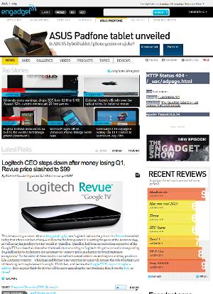
Engadget Before Recent Redesign
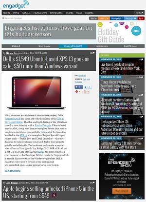
Engadget After Recent Redesign
Engadget Posted An Article Explaining Their Design Goals. They Wished For User To Give Feedback In The Comment Section And To Use The Engadget Contact Page. [8] The Reception Was Overall Negative. The Most Common Complaint Was The Font Was Harder To Read. The Second Most Complaint Was That The Slender Design With White Spaces On The Sides Made The Website Seem Blank On Large Screens. Slender Designs Are Becoming The Norm To Compensate Tablet Users. Engadget Has Been Listening To Feedback And That They Want To Address The Font Issue Soon. People Were Pleasantly Surprised That They Launched The New Layout Completely Compatible With Their Mobile App Without Updating The App. People Who Are On Desktops Are More Likely To Give Feedback Because They Can Easily Type And Are Not On The Go, So Many Of The Mobile Users May Not Have Spoken How Much They Liked The New Tablet Originated Design. Because Of This The Negative Response May Seem More Severe Than In Reality.
References:
http://archive.org/web/web.php
http://mashable.com/2009/03/30/youtube-redesign/
https://play.google.com/store/movies?feature=corpus_selector
http://www.youtube.com/watch?v=cw-NILysH1w
http://www.marketplace.org/topics/tech/tech-report-blog/everyone-hates-facebook-timeline
http://www.makeuseof.com/tag/4-reasons-hate-facebooks-timeline-view-opinion/
http://thoughtcatalog.com/2011/5-reasons-to-hate-the-new-facebook-timeline/#SrIkV61xWbBUXztC.99
http://www.engadget.com/2012/11/20/dnp-welcome-to-the-new-and-improved-leaner-and-faster-engadget/


