Graphic Designers Are Always Working With Ideas To Create New Typographies That Can Shape Their Designs Into A Façade. Constructing An Elegant Typography Work Is Not An Effortless Chore And Takes Time And Persistence. Simply By Altering The Font’s Color, Line-height, Style, And Size, You Can Call Concentration To Certain Parts Of Your Content, And De-emphasize Others. Choosing The Right Typeface, Colors And, If Necessary, Applying The Right Type Treatment Will Not Only Make A Design More Striking, But Will Sincerely Help In Passing On Your Message To Your Audience.
The First And The Foremost Thing You Need To Keep In Mind Is That A Block Of Text Should Be Inviting To Read And Not Look Like A Chore. One Of The Biggest Mistakes That People Make Is To Use Too Many Typefaces And Styles. Try To Limit Any Piece To 2 Or 3 Different Type Faces And Styles. This Means That The Body Should All Be One Font And Size. Choose One Header And Stick To It, Maybe A Subhead As Well. Don’t Be Afraid To Make The Fonts Very Different From Each Other. Using 2 Very Similar Fonts Can Look Like You Made A Mistake And Accidently Chose The Wrong Font. Consider Keeping Color, Spacing Etc, Consistent Or It Looks Like Drunken Flies Walking All Over The Page.
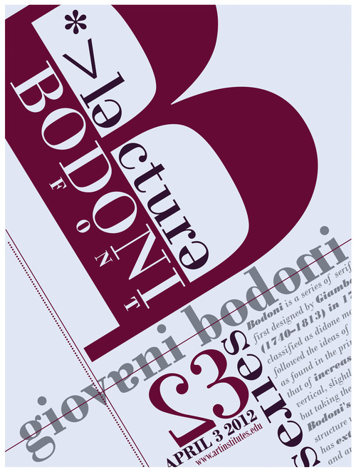
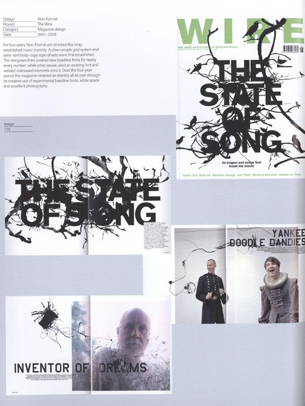
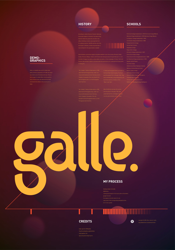
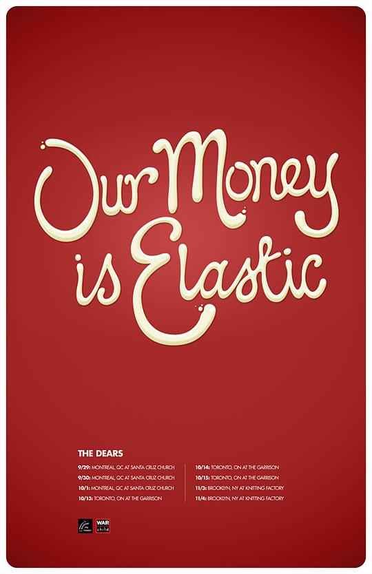
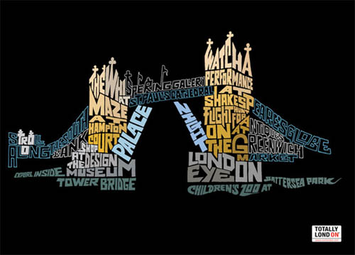
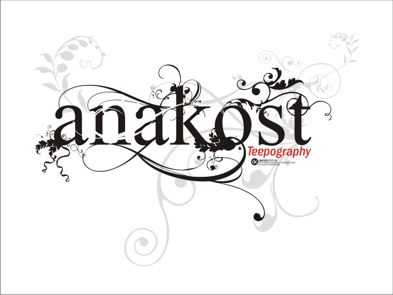
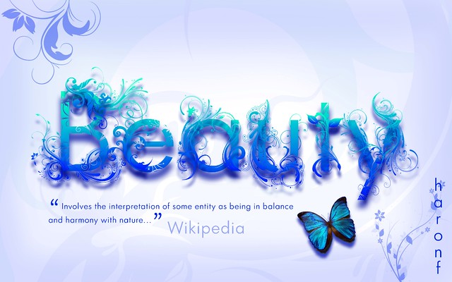
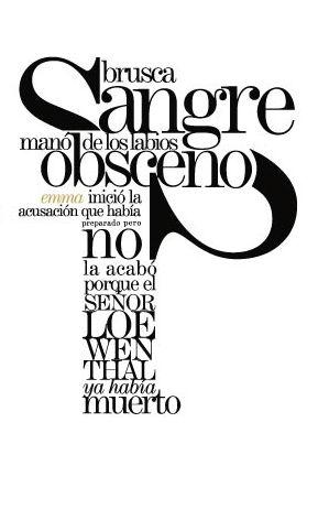
Kerning Is The Individual Spacing Between Characters. Often When Using Photoshop, With A Cap Followed By A Lower Case, The Spacing Is Too Wide. It Should Be Even Between Characters. I Like To Do It This Way, Look At The First 3 Characters And Adjust The Balance If Needed. Now Move Onto Character 2-4 And Adjust #4 If You Need To. Work Your Way Through 3 Characters At A Time. After A While, You Will Instinctively See When The Kerning Is Messed Up. Don’t EVER Change The Aspect Ratio Of A Character, Don’t Stretch Or Squish It. Finding Novel And Cooperative Sources Of Typographical Inspiration Can Often Help To Perk Up The Use Of Type In Your Work. Here Are Some!









.jpg)

