5 Tips For Using Typography On the Web
Typography Is An Essential Component Of Successful Web Design. Not Long Ago, Designers Developed Their Own Typefaces Or Chose From A Handful Of Established Fonts. Web Design Has Drastically Changed, As There Is A Huge Influx Of New Fonts Every Day, Most Of Them Accessible To Anyone. With This Come Countless Options And More Freedom, But It Also Requires Deliberate Planning And An Understanding Of Good Design Practices. Though You Could Probably Find A Free Decorative Font To Illustrate Virtually Any Occasion Or Project, Web Design Still Requires Skill, Practice And Discipline. Here Are Some Tips To Help You Keep To Good Web Typography Practices.
Maintain Functionality
Just As Any Other Part Of Design, Typography Is Meant To Serve A Purpose – Which Is Usually To Convey Content. Content Is Only Functional If It’s Easily Read, So It’s Important To Not Lose Sight Of That Simple Concept. Much More Goes Into The Functionality Of Typography Than Simply A Font Choice, As It Is A Design Process Of Its Own. Maintain Its Functionality Through Readability, Hierarchy And Styling.
Create Contrast
An Effective Way To Promote The Readability Of A Design Is To Ensure There Is Stark Contrast Between The Background And The Text. This Reduces Any Possibility Of Eyestrain On The Readers’ Part, And Allows Users To Focus On Content Without Struggling Or Getting Distracted.
Develop Visual Hierarchy
In Order To Guide Viewers’ Eyes Throughout The Page, You Must Create A Hierarchy Of Elements. This Can Largely Be Done Through Your Choice Of Type Style. For Example, A Bold Serif Font Calls Attention, While Thin, Sans Serif Fonts Encourage A More Fluid Movement. Depending On The Purpose Of Your Site And Its Content, Style Your Type Accordingly.
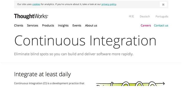
This <ahref=”http://www.thoughtworks.com/continuous-integration” Target=”_blank”>Continuous Integration Web Page Uses A Thin Sans Serif Font To Create An Airy Design That Allows For Easy Reading.

The Bold, serif At The Top Of This Design Immediately Calls The User’s Attention, And Then Guides The Eye To The Rest Of The Page. Fonts Like This Are Great For Titles And Headlines Because Of Their Commanding Design.
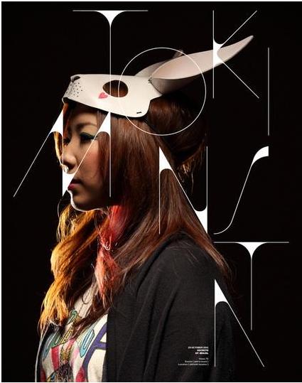
This Decorative Font Acts As A Creative Design Element. The Designer Has Skillfully Used This Type Design To Creatively Develop And Communicate The Brand’s Image Without Having To Focus Fully On Content.
Use Adequate Size And Spacing
Large Contributors To Readability And Visual Hierarchy Are Size And Spacing, And They Are Arguably Just As Important As Font Choice. Bigger Sizes Command More Immediate Attention, While Large Amounts Of Content Should Be Large Enough For Any User To Read, But Not As Big As Headlines. Use Size To Imply Which Elements On The Page Are Most Important.
A Skill That Comes From Practice And Experimentation Is Working With Type Spacing. This Includes leading And Tracking, Which Are The Spacing Between Lines Of Text And Between Characters. Viewers Should Easily Be Able To Differentiate Between Letters (even With Decorative Fonts) If You Want Them To Perceive Your Information.
Utilize Tools
With So Many Type Tools Available, Implement Some Of Them Into Your Design Process So That You Can Become More Effective And Successful In Your Design Decisions.
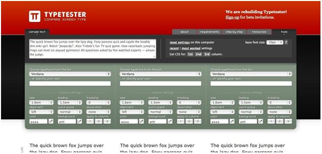
Typetester
Type Tests Can Get Messy And Tedious, So This Is A Great Tool For Simplifying The Process. It Allows You To Choose Three Fonts At A Time To Compare On The Screen At Once. Customize It With Your Own Text To Get An Accurate Visualization Of What Your Content Will Look Like In A Particular Font And Size/spacing Settings.
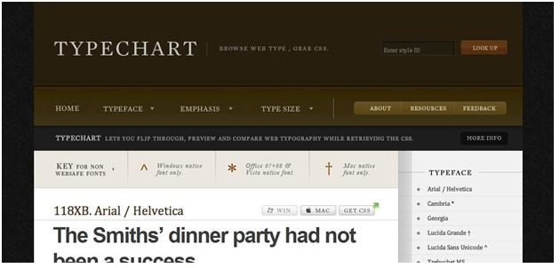
TypeChart
This Site Enables You To Browse And Compare Fonts In A Library Of Web Typography. This Is A Helpful Way To Brainstorm And Even Implement Into Your Design Through Its CSS Download For Each Font.
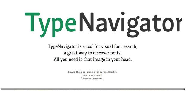
TypeNavigator
Use Your Creativity With This Tool By Searching And Browsing Through Free Fonts Based On Images You Have In Your Head. A Whole New Way To Brainstorm With Type, You’re Sure To Find Something Inspiring.
Use These Tips And Tools To Help You Become More Confident In Your Type Design. With Practice And Experimentation, You’ll Quickly Learn The Ins And Outs Of Typography Use On The Web, And Consequently Create Effective And Functional Uses For Typography.