
Most of the people take logo designing as a pretty easy task as the name suggests. They are of the view that simply draws any shape, write the name of the brand/company and you are done. While the reality is opposite to this idea. Logo plays an important role in recognition of any of the brand and that in turn make it an important part. In such a saturated market, it is not easy for any company to compete with its opponents.
A simple logo can give you only a few bucks of money from the client. Well, if you want to earn a huge sum of money then you will have to take this simple task seriously. This article will reveal few of “don’ts” that you must have to avoid in order to design a professional and eye-catchy logo.

Draw logos in vector format
After doing all your designing and when you are about to deliver the logo to your client, your client may ask you to deliver the logo in vector format. On listening to such a request of your client you may feel panic. Therefore, it is always recommended to draw the vector logo. Vector format makes it possible to edit the image as many times as you can.
It is not necessary that the client will like your work at the very first submission, he may need few changes in it. As the vector format images are not resolution bounded, therefore you can easily resize the designed logo without compromising on the quality of an image. the
A logo is a reflection of a company, that’s the reason that client will prefer that designer who is not limited to making changes in the logo. For your convenience as well as for client’s approval, vector format is recommended.
Do not look for inspiration on logo stocks
The logo is a foundation of a brand or company. When a logo is such an important part of any company, therefore it must be unique as well. Logo designing needs a creative mind in order to make brand prominent in the eyes of customers.
A unique logo will distinguish the brand from other similar brands in the market. A BIG NO to looking at stock images and taking ideas from them for your logo. Stock images are free and open to all the individuals. You may think while designing that the stock image, you are taking as an inspiration, is not used by anyone but you can be wrong. Even if it is not yet used by any brand, then sooner or later you will see it being used in the logo of any other similar brand.
Even after working so hard and trying to come up with something amazing, a single mistake can ruin your whole designed image. Most of the local brands do not spend much on these elements and go for already available images. Having similar or even close-to design of the logo can affect the brand image. Take some time, let your tortoise mind come up with some creative ideas and end up with a magical design.
Avoid unnecessary complexity
You just started working on a big project with a tight deadline. Your mind is full of ideas that are bursting out of your head right on the sketchpads. While mapping all the innovative ideas, the deadline is approaching closer. In order to complete your work on time, you combine few strong approaches and make a logo. Well, the problem that arises here is your logo design is very complex and communicating a number of messages to potential customers.

Keep in your mind, the major aim of designing a logo for the company is to communicate ‘what the company has to offer’ to its customers. While looking at the logo, if people are not able to understand that what the brand is about then they may switch to the other brand.
Most of the designers while designing a logo are so enthusiastic in making a unique logo that they end up in a designing a complex one. The solution is that keep your logo simple. You can add up interesting elements but do not complicate it.
Choose reasonable fonts
While your logo is under construction, one of the important decision that a designer has to make is a font of the logo. Most of the logos are unsuccessful and misunderstood due to poor choice of font.
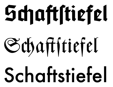
One of the best ways of selecting a font for your logo is to look at the style of a logo but it is quite a tricky job. If both font and style of the logo are very close, then it can result in competition among both. If style and font are opposite then one can overshadow other. None of these conditions are suitable for your logo. Try to find out balance among both the elements. Both style and font should be reflecting each other. Font and style must act like pieces of a puzzle, and when both are combined, then give a clear idea and message.
Most of the time bad selection of font is due to the non-serious attitude of designer while choosing one. As a designer, you must have to take this decision seriously and select a reasonable font.
Less follow trends
One of the biggest mistake that logo designers make while designing a logo is relying on trends. Keep in mind that logo of your company or your client’s company is for a lifetime. Trends changes with the passage of time. If you follow current trends, then on changing of trends your logo can face serious issues. It is better to follow less or even no trends while designing logos.
As a designer, it is your job to play safely while designing a logo. Your logo must be unique and appropriate for a lifetime. It is not easy for a brand to change their logo with changing trends. As frequent changes in logo design can result in confusing potential customers. You must be aware of the latest trends in order to avoid them.
Do not copy anyone’s ideas
One of the most common mistakes repeated by most of the designers is to copy logo designs. A logo is a representation of a brand. If the logo of any certain brand is similar to other, then it will not be able to fulfill its purpose.
Copying the ideas of other people may save your time but is not in yours as well as the client’s favor. Copying a logo can also take you into copyright claims. As a designer, you must know that copying ideas of others is a crime.
Choose the right colors
A color palette is one of the most important considerations for your logo. Color has meaning as well as communicate messages.
In few cases, you may have to stick to the color of the brand while designing a logo. Contrary to this, in other cases, you may have the freedom to choose colors as per your choice. Colors can bring life to a simple image and can communicate a strong message. You can make a just two-tone logo or can add various colors, depending on the nature of the brand.