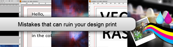
Making Mistake Is Human But Sometimes It Is Not Taken For Granted Especially When It Is Concerning Customer Satisfaction. In Design Prints Some Mistakes Are Affordable But A Combination Of Few Can Cause Trouble. Not Only Newbie But Also Some Seasoned Designers Ignore Certain Facts And The Result Disappoints Their Client. When Designing Your Brochure, Business Card, Flyer, Or Any Other Printed Project There Are Some Mistakes You Must Avoid At All Cost. Take A Look At My List Of 10 Mistakes You Must Take Care Of.
No Bleed

Avoid Trouble By Not Forgetting To Put A Decent Bleed In Your Artwork. Bleed Essentially Refers To Artwork That Extends Beyond The Document Boundaries. This Is Necessary Because The Beheaded That Will Chop Your Prints Aren’t That Precise. Some Might Look Acceptable, But To Be On The Safe Side, Have 3mm Of Bleed (or 1/8 Of An Inch) For Most Print Projects Like Posters, Letterheads And Business Cards, Etc.
Small Texts On Rich Colors

If Your Text Is Designed To Appear On Rich Backgrounds Like Black Make Sure The Text Is Free Of Colors That Merges Likes Cyan, Magenta And Yellow. The Best Bet Is To Use White Text On Black. For A Richer Black Background, You Can Use Small Amounts Of Colored Ink For More Apt Results. This Principle Doesn’t Just Apply To White-on-black And Also Holds True For Any Colors And Text On Textures, Too.
Not Converted To CMYK

You Ought To Know The Difference Between RGB And CMYK Else You Shouldn’t Be Sending Anything To Print At All. You Must Learn These Basics Before Making A Posh Error That Can’t Be Afforded. Never Forget To Convert Images To CMYK. Though Modern PDF Standards Will Convert RGB To CMYK Robotically Upon Saving, Yet The Switch May Throw Your Color All Over The Place. To Be Sure, Convert Profiles After Either Working In RGB Or If You’re Using Digital Photos.
Quiet Borders

A Quiet Border Is A Type Of “buffer” Area, Where No Text Or Defined Elements Like Logos Can Be Positioned. A Quiet Border Is At Least 5mm (nearly 1/4 Inch) From The Edge Of The Document. In The Illustration Above, The Edge Of The Document Is Shown In Black. The Red Line Is The Bleed Boundary. This Unreal Border Is Essential Because The Guillotines Can Also Trim Up To 3mm Off Your Artwork. This Would Mean That Text Could Be Chopped Off If A Quiet Border Isn’t Observed.
Low Resolution

Image Resolutions For Print Must Be Between 300 Pixels Per Inch (ppi) And 400 Ppi. High Ppi Can Also Cause Problems, But The Main Blunder Some People Make Is Setting The Resolution Too Low. The Common Mix-up Is Using A 72 Dpi (dots Per Inch) Image Instead Of One That Is 300 Ppi Or Higher. Another Common Mistake Is Using A 72 Dpi Image That Originated On The Internet, And Using It For Print By Enlarging It. This One Is A Big NO!
Raster Text And Logos

For Many “hand-held” Print Works Such As CDs And Booklets, Using Vector Typography Is An Obligation As This Is A Root Cause Of Many Printing Mistakes. Avoid This And Your Text Won’t Look Sharp. If You’re Designing Large Posters, For Instance, Using Text In Photoshop May Work Well If The Type Is Over 16pt. This May Actually Be Better If The Typography Has All Kinds Of Treatments And Effects Applied.
Using .gif Or .png Formats

.gif And .png Files Are On-screen-only File Formats And Are Not Meant For Print And Will Not Print Well. This Is Because They Are Designed To Handle 72 Ppi, Whereas Images For Print Need To Be In The 300-400 Dpi Range. For Very Small Images In Print, You Can Do With It, But Better To Get Into The Practice Of Using .tiff Images When Designing For Printed Stuffs.
Not Flattening Layers Before Exporting To PDF

When You Have A Deadline And Need To Export Your Awesome Artwork From Illustrator As A PDF This Mistake Might Happen To You. If You Do Not Flatten Layers First, Your File Will Be Huge. Your Artwork Might Still Print Okay, But Can Bloat Your File Size And May Send Your Printers’ Macs Into Meltdown. So, If You Want A 1mb File Instead Of A 10mb One, It Is Advised To Flatten The File!
Not Supplying A Hard-Copy Proof

Your Printer Might Not Require Them For Small Print Jobs, But They Do Encourage You To Use Their Color Charts. Conversely, For Anything Grand Or Really Expensive, It Is Proposed That Sending In Some Printed Proofs Is Always A Safe Bet.
Not Locking Layers

Even When Your Design Is Perfect And You’ve Printed It Out And Proof-checked It, There Is Something That Can Go Wrong. You Can Accidentally Nudge Your Mouse Which Moves Some Text Or Image Out Of Place Because Your Layers Aren’t Locked. If You Are Distracted Somewhere Else There Are Chances That You Don’t Try To Close The File Straight Away. The Situation Is Shoddier When You Only Nudge An Element Very A Little, And Isn’t Noticed Until It’s Too Late. So, It Is Always Advised To Lock Layers Before Saving Or Finalizing.