Color is nothing short of a powerful communication tool. It’s able to change our mood, provoke emotions, inspire behaviors, or even cause physiological reactions like increasing our heart rate. Choosing the right color palette for a website is a serious issue – colors will communicate your brand message, sell your services or products, and significantly affect consumers’ perception of your company. Here are 5 practical tips on how to choose color in web design and achieve your branding goals.
1. Establish your target audience

Before deciding on a color palette, make sure to have a firm grasp on your demographic. Colors can mean many things in different cultures – for instance, white stands for mourning in China and the purple color is associated with death in many Catholic countries.
Location is not the only aspect of your target audience you should consider. Age is another important metric. If your audience is young, saturated and lively colors are most likely to work to your favor. Mature audiences, on the other hand, might find them offensive and quickly leave your website.
2. Gender your color

A different metric of value is gender. This KISSmetrics study points out that while women like blue, green and purple, men tend to go for black instead of purple. Moreover, men reported brown, orange and purple to be their least favorite tints. See a pattern here? Evidently, purple can be very tricky.
That’s why it’s important to research your target audience before you settle for a color scheme. Play it safe, test your website (A/B testing will work great in this case) and prepare for some major changes if your color scheme is discovered to divert users’ attention and affect your conversion rates.
3. Choose colors to match your product
Website elements, such as graphics, headline types, borders, backgrounds, buttons and pop-ups need to be coherent when it comes to color – not only with each other to create a sense of balance and harmony, but also with what you’re promoting.
For eco-friendly and outdoor products and services, green is an absolute must. It’s the chromatic symbol for nature itself and people tend to associate it with the environment. Blue will be perfect for products that require consumers’ trust, like social media (think Facebook) or online transaction systems (PayPal) – it sends a message of serenity and trustworthiness.
4. Use bright colors for call-to-action messages

If you want users to instantly spot your call-to-action, there’s no better way to gain their attention than by using bright primary and secondary colors like red, green, orange or yellow. Darker colors, such as black, dark gray, purple or brown usually have lower conversion rates.
Yellow buttons are a classic – together with orange, they’re the ‘ugly’ colors that work great when it comes to conversion rates. Something that goes against our aesthetic sense often captures more attention than what perfectly fits our website’s color scheme. Think about it next time you’re designing a call-to-action box or button.
5. Don’t shy away from white and black

This is a perfect tip if what you want to achieve is a clear and uncluttered layout. Using white or negative space as your background, your website automatically gains on sophistication Channeling a simple and modern look is really easy with this color.
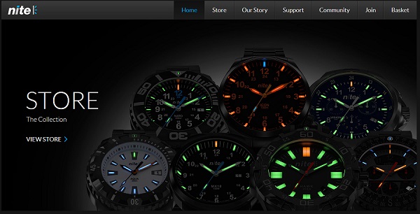
Black can work well too. After all, it’s the color of elegance, power and contemporary style, but only for certain brands and products, usually meant for mature consumers. When choosing black as your background color, take extra care to make sure your lettering is visible and messages easy to read.
Choosing the right color palette for your website will not only increase your brand visibility, but also improve your conversion rates and communicate your brand message to consumers.
Monique Craig is an Australian blogger and marketing specialist who works for Oneflare, an online marketplace which connects customers with local service providers.
