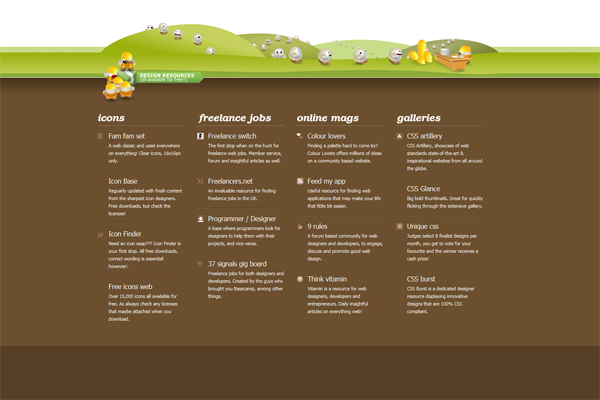
In the world of web design, footers tend to get marginalized – who cares what’s at the very bottom of the page anyway? The truth is that users do care about it. In fact, if they take the time and effort to scroll down the website it usually means that they’re engaged with your brand and want to learn more. It’s your job to create a visually stunning and highly informative footer. Here are six tips on how to do it and reward your visitors with a truly engaging and functional design.

What makes a footer great
There are several key features all great footers have in common. A perfect footer is visually captivating and fully integrated with the general framework of the website. But that’s not all – a great footer includes links to important sections of the website and points to some additional resources that users might find valuable. It conveys the brand message, displays its accolades and adds a sense of trustworthiness to a website. Not bad for a little footer, right?
How to create a perfect footer
1. Go visual
Footers must be highly functional, but it’s great to integrate their role with some truly beautiful design. Keep it simple – there’s a lot of information to include and it all should be engaging and readable. Use graphic elements, such as icons, images, colors, as well as text and logos. Don’t overdo it, or your footer won’t do its job.
2. Integrate it with your website
When designing your footer, you must remember that it’s an integral part of your website, so it should fit its visual design. You can create a sense of continuity by using the same theme, color, style and tone. Repeating visual elements from the header is a good idea too. Doing that, you’ll ensure that users know exactly where they are and won’t be distracted by any random design elements that have nothing to do with the rest of the website.
3. Ensure that contacting you is easy
Why do users scroll down the page to see your footer at all? Mostly, because they’re looking for some general data – links to ‘About Us’ and ‘Contact Us’ pages are essential. Apart from these, include some detailed contact data to make the footer look professional. If you’ve got a team, create a section with their bios and photos, placing the link in the footer as well. Sometimes people lose business cards and finding this kind of data on company websites makes their lives easier.
4. Include call to action elements
Given the fact that scrolling down, users are already engaged with your brand, it’s a great idea to include some call to action elements. Feature a newsletter signup form or a social media bar – if needed, create a sub-footer to fit them all.
5. Share valuable content
Having included all the essential data, as well as chosen call to action elements, it’s time to consider the perspective of the user. What else could they find interesting in a footer? Industry experts suggest that a footer is a great place to share interesting materials and valuable resources. Think twice before you add any links to this kind of content – it will be displayed on each and every page of your website.
6. Add a sense of trust
Footer elements that range from copyright statements to privacy policies will make the website look professional and trustworthy. Accolades are great as well – you can easily suggest them with logos of brands who trusted your services
Even if they seem insignificant, footers are actually really important – they not only provide crucial information, but also reflect brand personality and can considerably improve consumer engagement with your products or services.
Monique Rivers is an Australian tech blogger who also loves good food and fashion. She works at ninefold.com. Ninefold is a powerful Ruby on Rails platform, that allows you to deploy Rails apps quickly and easily.
